
Guide to Mix Paint and Get the Right Shade Without Failing
By: John Garcia | Date Posted: January 13, 2022
Table of Contents
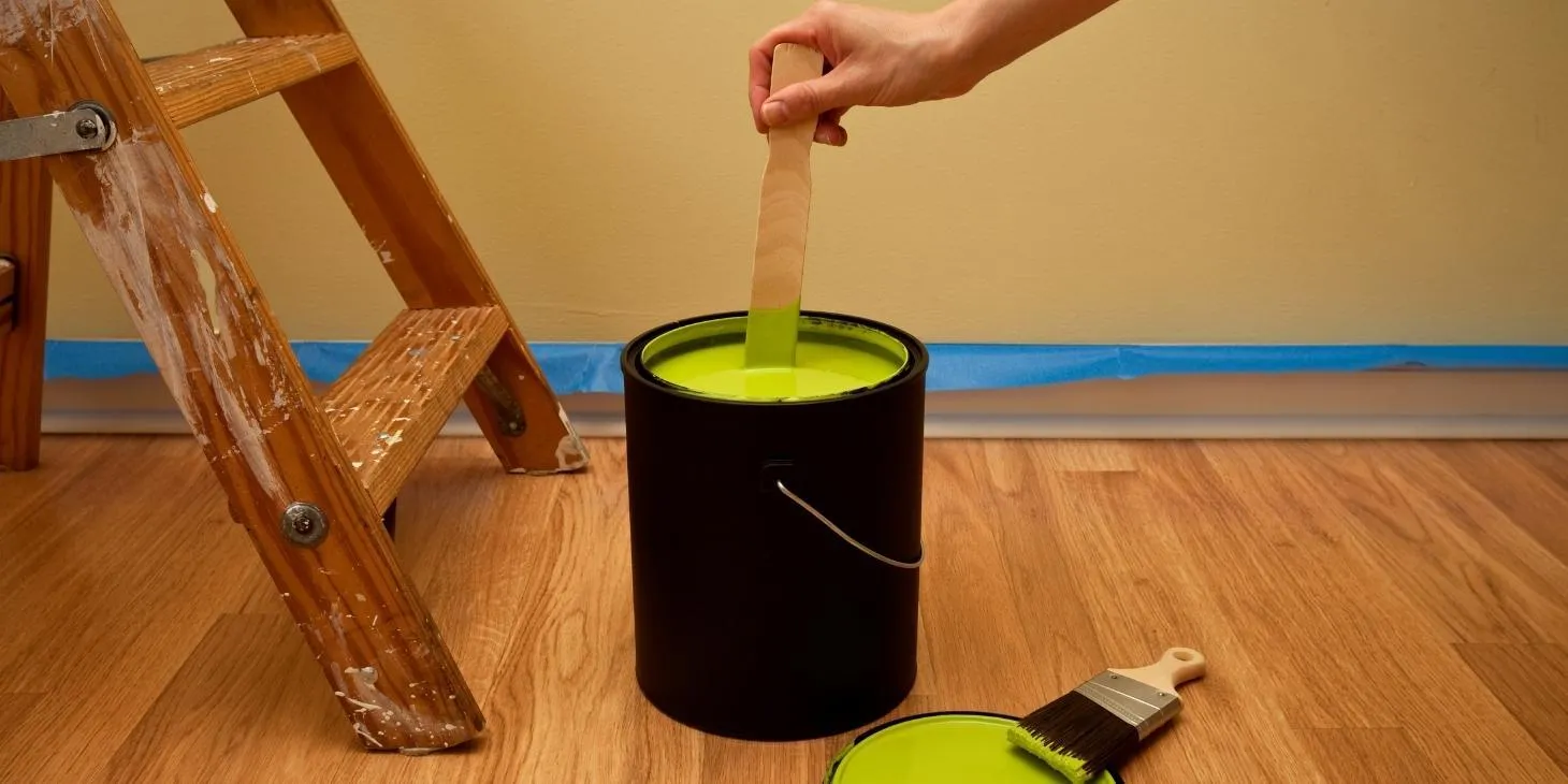
It is very common for artists and painters to mix their color pallets to get the perfect shade. If you are a beginner, this is probably one of the first things you’ll be learning about.
Guide to Mix Paint
In the world of art, understanding how colors work together is considered to be basic knowledge. All painters must learn to blend colors to create a new, ideal tone for their work. It can be confusing at first, but learning the basics of art will take you a long way. In this article, you’ll receive a guideline, similar to the artincontext color mixing guide, that can help you feel more confident about mixing and using colors.
The Hidden Meaning of Colors
You might be wondering – what is the reason to create your mix if you can buy all the possible shades of colors that you may ever need or use? Well, from an artist’s point of view, using different shades of colors has a whole different meaning. There is a hidden meaning of colors in the world of artists. It is known to be a powerful tool in art.
Colors affect people and artists are aware of this when creating art. They use certain colors to captivate their audience. The colors used on a piece of art, or design, can immediately impact the state of the audience’s physical and mental well-being. The colors that are used can affect our state of mind, to some extent. For example, certain choices of colors in our bedroom can help us relax and sleep better.
An artist, or a painter, will not rest until they have found the right shades of color for their art. The artist might be restoring a painting – that requires a specific mix of certain colors. Another reason could be to complete a previous, unfinished, project. Sometimes while creating art, artists often want to match the exact color of a specific object.
Should you be Mixing your Colors?
There are various techniques used in painting, and one of the main skills is being able to match and blend colors. Mixing colors is necessary to expand an artist’s horizon and usage of images and shades.
For beginners, the initial color palette will probably include just a few colors. But if you know how the primary colors work, you’ll be all set to create any shade you want. The primary colors are blue, red, and yellow – and you only need these three colors to be able to create any color and shade of your choice. But first, you have to learn how to mix them properly.
You’ll often notice that after getting the paint out of the tube, the shade of the color has slightly changed. Sometimes it’ll need an undertone, or to be brightened up. This is exactly why learning how to mix colors is so important.
It can also be helpful if you run out of a specific shade. Knowing how to mix colors can save you both time and money. It works out well from all ends, as buying every single shade can become an unnecessary expense if you only need a small amount of it – so, it’s better and much cheaper to learn how to mix your own.
Matching Color to Color
The first and most important variable to take into consideration when mixing or matching a color – is the initial color itself. There are many elements that you have to take into consideration, for example, what the shade of the color will be when it dries up.
It is common for some colors to appear brighter after drying up. This is a learning process that requires a lot of practice, and patience, to get the desired tone of color. Experts suggest that mixing a shade darker than desired solves the problem. However, it is advised to wait for the test swatches to dry up completely before you begin to make adjustments to your mix.
Choosing Pigments
It is essential to start your mix with the correct pigments. The trick is to use a minimalistic amount of colors when you start mixing. In this case, less is more. Fewer colors also mean that it will be slightly easier to remember the combination of colors, for the shade you mixed.
A combination of warm and cold primaries offers enough options to allow you to mix any desired color. The trick is to follow a simple process by using just primary colors and mastering your art with your color-controlling skills.
Recommended Pigments
Warm Primaries
Cadmium red medium, Cadmium Yellow Medium, and Ultramarine blue.
Cold Primaries
Alizarin Crimson, Chrome Yellow, and either Cerulean Blue (for landscapes) or Phthalo Blue.
Every color added to the mix can give a fuller result. If you are attempting to mix colors, be aware that the mixture can make the color duller than what you were aiming for. Artists often start over when they see their mix is turning slightly duller than expected. Attempting to bring it to your desired tone often turns out to be a greater waste, of both color and money, than if you just start over.
The Color Matching Process: Step by step
- The first step is to identify a hue with the help of the color wheel. Every single color is likely to be like the 12 colors on the wheel, including brown and gray. For example, shades of brown lean toward a hue of red and orange. Shades of gray lean towards hues of blue and green.
- Start by mixing the hue that you identify from the primary colors. For instance, if it is not a primary color, refrain from using cold and warm options of the same hue in your mixture. To be more precise, don’t mix Cadmium Red and Alizarin Crimson.
- Add white to the mixture to get the desired shade.
- If you have identified the base hue, use the complementary hue to get the color you want, by adding or reducing the brightness. To become an expert in mixing colors, you must know how to adjust the intensity of colors.
Pro-Tip
To be able to judge if the two blending colors match, the two colors must touch each other on the mixing palette, and then on the canvas. This is the only way to notice subtle differences.
There are a few opaque colors in oil paints and acrylics that allow the artist to correct the color, even if the colors have dried. This particular technique is called glazing – and because of this, artists love working with oil and acrylics.
Conclusion
From a regular person’s perspective, colors are like icing on a cake. It adds to the beauty of the painting. Even if you’re just painting your walls. But from the artist’s point of view, the value is the cake. So, don’t take it so seriously that it limits your creativity.
Take your brush and get your colors – focus on your value. You’ll see that there’s a whole new world of colors out there, waiting for you to discover them.
Thank you for reading!